Rain City Rock Camp

Role: Design, Photography

Date: 2016-present

Type: Music camp for people marginalized by gender

Location: Seattle, WA

Applications: Adobe Illustrator, Adobe Photoshop, Adobe InDesign, Photographs were shot with a Nikon D3200 and have only minor edits, such as lighting and cropping


Gala Materials

For Rain City Rock Camp’s 2022 Gala, I provided last-minute design assistance for signs, decorations and postcard hand-outs. Color scheme and many of the design elements were inspired by the 2022 Gala Logo, by designer Enjoli Izidor

Applications: Adobe InDesign, Adobe Illustrator, Adobe Photoshop

Postcards

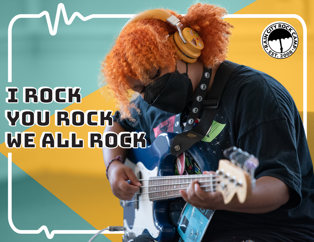
RCRC wanted five postcards, the inspirations for which were: adult programs; youth programs; Rock Camp’s new space, The Umbrella (featuring the mural that campers painted on the wall); a drum kit with the RCRC logo; and the gala logo.

I overlaid images with color blocks to reduce distracting background information. The phrases I chose are from Rock Camp programs. I felt they all worked well with their theme/image but were vague enough that they could accompany a variety of messages a sender might write.

Applications: Adobe InDesign, Adobe Illustrator, Adobe Photoshop


Centerpieces

Table Centerpieces at the Gala were made out of 45 rpm records (the small ones). I made new, gala-themed record labels inspired by vintage records. I wanted them to appear from far away to be random records and become noticeably themed upon further inspection.

Applications: Adobe Illustrator


Signage

These four signs were printed 21.5” x 27.5” and used to help guests wayfind. All elements were taken from the Gala logo.

Applications: Adobe Illustrator


album art

For summer camp 2020-2021, designers created album art for camper bands using descriptions and inspiration from the campers. These artworks were all done in one evening and were extremely fun to work on.

Applications: Adobe Illustrator, Adobe Photoshop

My Iguana Loves Flowers was an intern band who wanted an image of an iguana at a school dance with a disco ball, flowers and ‘80s vibes.

Original concept art:

Screen Shot 2021-08-29 at 9.02.33 PM.png
DevilDonuts.jpg

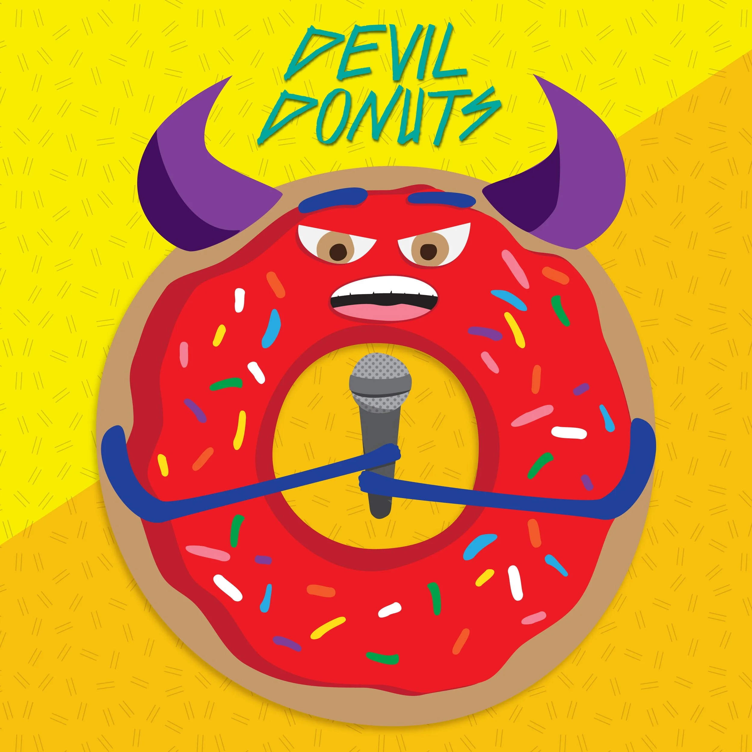
Devil Donuts were a band of 10 year-old musicians who wanted, “A devil donut singing into a microphone; ‘Devil Donuts’ in teal text right above the picture. Donut colors: tan/beige donut, red frosting, multicolored sprinkles, purple horns, dark blue arms holding the microphone.”

Screenshot of concept art:

Screen Shot 2020-08-02 at 8.08.05 PM.png

Seattle Rockin’ Radio wanted a warm-colored image with two red pandas who are friends, with the band name on the top and the song name on the bottom.
Tangerine Dream was an intern band who wanted a dreamy image of a sleepy moon with tangerine cheeks floating in the ocean and a sun in the background. They wanted the band name and song title included in the artwork.

Concept Art:

Tie Dye Hyper Cats! were a young band who wanted a silly, fun artwork with their band name and song name along with a “Band of cats in tye dye shirts (one guitarist, one drummer, one vocalist) in front of a guitar shaped pool (the pool is also tye dye)” and the colors green, purple and pink.

SITAB.png

Sometimes I Think About Penguins. wanted a person with a thought bubble of a penguin and their name in different fonts and colors.

Concept art:

Screen Shot 2020-12-11 at 4.11.39 PM.png
OceanGirls.jpg

Ocean Girls were a band of 8 and 9 year-old rockers whose concept was, “Four girls on an island surrounded by the ocean. If possible, they want the girls’ faces to have waves around one eye, think Kiss makeup. They also had the idea of having moldy lost instruments that have been under the water but are now on the island, maybe with barnacles on them or something. They like the colors teal, purple, green, white. If possible, it would be sunset. Band name at top.”

I used screen shots from zoom to draw the girls’ faces.

BLR.jpg

BLR was a band of 12-13 year old campers whose band coach described their idea as, “The band name is BLR (pronounced blur) They would like it to look like a computer monitor that is glitching. They like teal and hot pink for the glitchy lines. For the letters, they would like something bold for the text, but also kind of curvy, but not too curvy, just not straight lines.”

Screen shot of concept art:

Screen Shot 2020-08-02 at 8.32.16 PM.png
GoldenFlyingPugs.jpg

The Golden Flying Pugs created their own gorgeous artwork and took a photo of it. I cleaned up the photo and formatted the artwork into a square.

Original artwork:

The Golden Flying Pugs.jpg
 
FB_IMG_1548948740514.jpg

PHOTOGRAPHY

I have taken candid photos, band photos and showcase photos for Rain City Rock Camp’s Adult Rock Camp. To respect participant privacy, My portfolio only includes photos that were used in materials shared publicly by RCRC.

Over the period of three days, participants of Adult Rock Camp form bands and each band writes a song and performs it at the showcase. The photos used in these Adult Rock Camp Showcase posters were band photos I took at a previous Adult Rock Camp.

Graphic Design: Sue Spang

Tools: Adobe Photoshop, each photograph was shot with a Nikon D3200 and has only minor edits, such as lighting and cropping. 

 
06.jpg

This photo from an Adult Rock Camp showcase is on RCRC’s website accompanying information about Adult Rock Camp.

Artboard 2.png
 
 
FB_IMG_1549080291632 (1).jpg
Artboard 6.png

This photo from an Adult Rock Camp Showcase was used for promotion of RCRC’s 10 Year Rocademy Award Bash event.

 
FB_IMG_1549080281148 (1).jpg
Artboard 6.png

YOUTH Rock Camp

I have taken photos at Youth Rock Camp showcases. This photo has been used to promote RCRC’s South Sound Rocks! programs.

Artboard 2.png